Facebook
Product Designer
Increasing user exposure of new apps in the Oculus Store.
Short Term Project
SUMMARY
1
Product Background
2
Problem & Value
3
Exploration
4
User Research
5
Outcomes
The product
The App Store for Oculus Quest (VR, Mobile and Web).
Key responsibilities
Intern project; worked with XFN team to tackle a design challenge for the summer.
What made this unique
Created designs across 3 platforms: VR, Web and Mobile with weekly design critiques.
THE PEOPLE (the best part)
Oculus Store Team
Lyndon Mayer
Chris No
Jon Malkemus
Tianyu Koenig
Charles Hodgkins
Soh Tanaka
John Kumahara
Gabby Hoefer
Design Manager
Design Manager
Product Designer
UX Researcher
Product Designer
Product Designer
Product Designer
Product Design Intern
THE PRODUCT
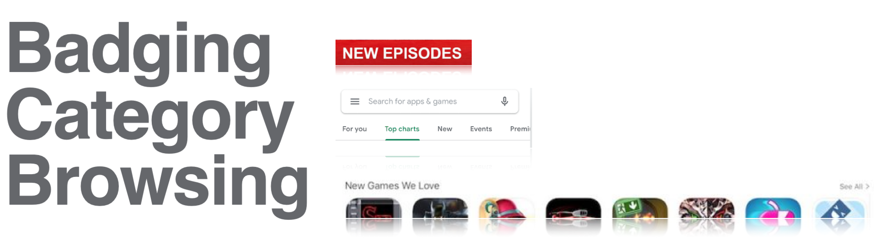
Oculus Quest: VR, Mobile and Web
Quest VR image that is free for commercial use Quest VR image that is free for commercial use
Understanding how new releases are accessed across platforms.
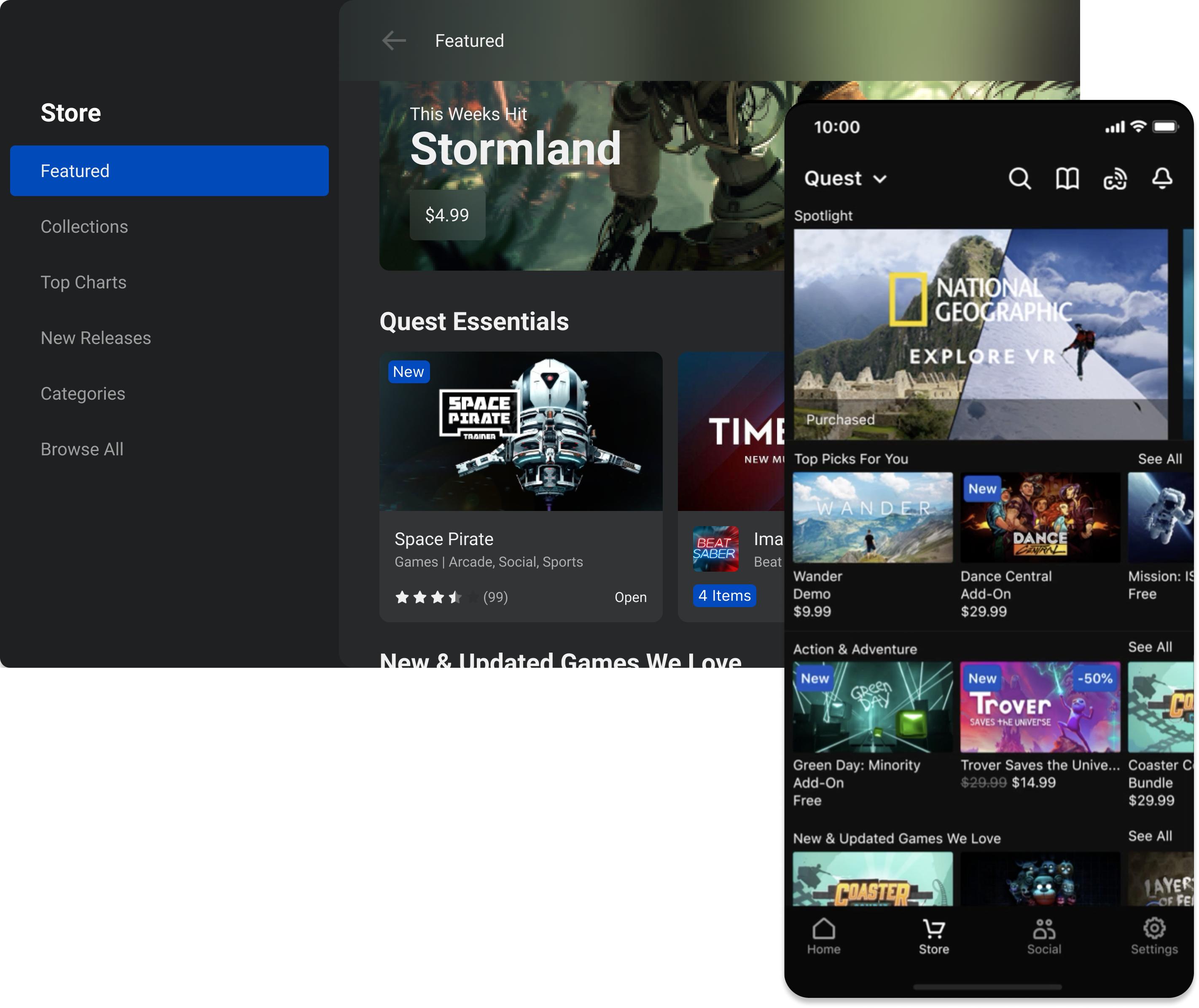
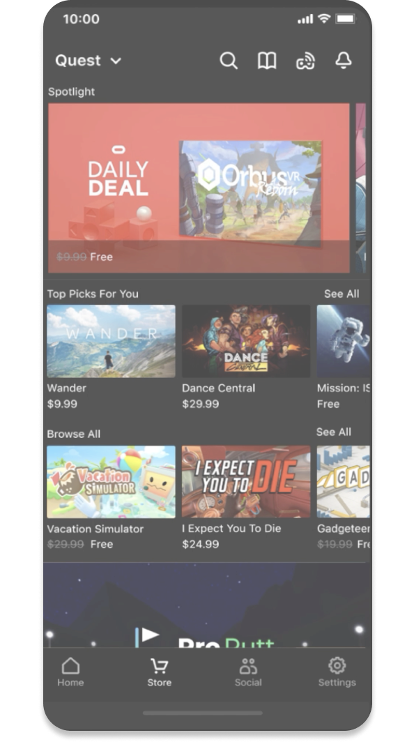
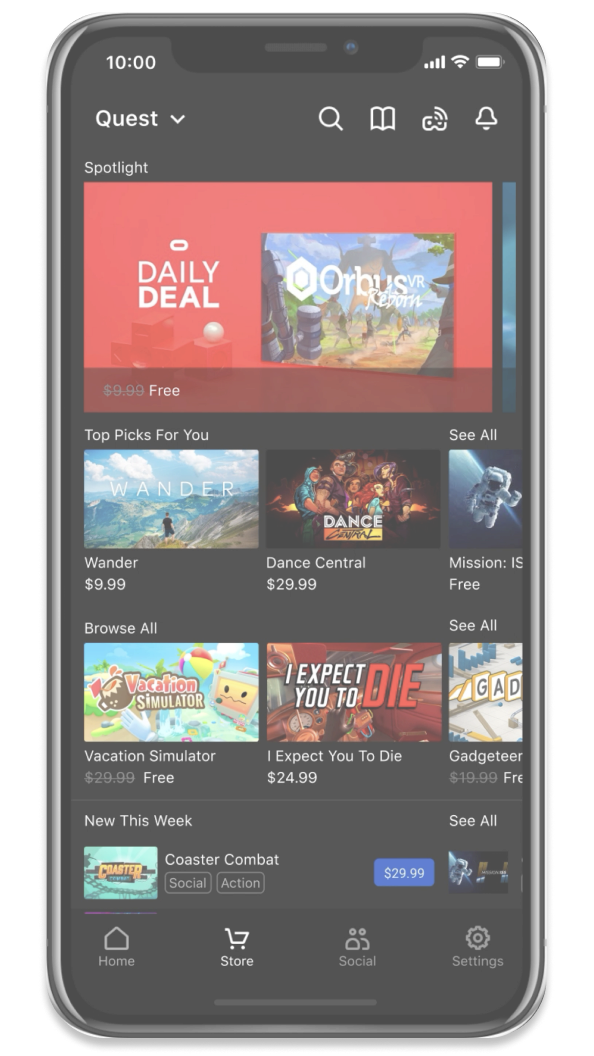
To get my feet wet, I evaluated the entry points across each platform of the store to understand how new releases were being surfaced.
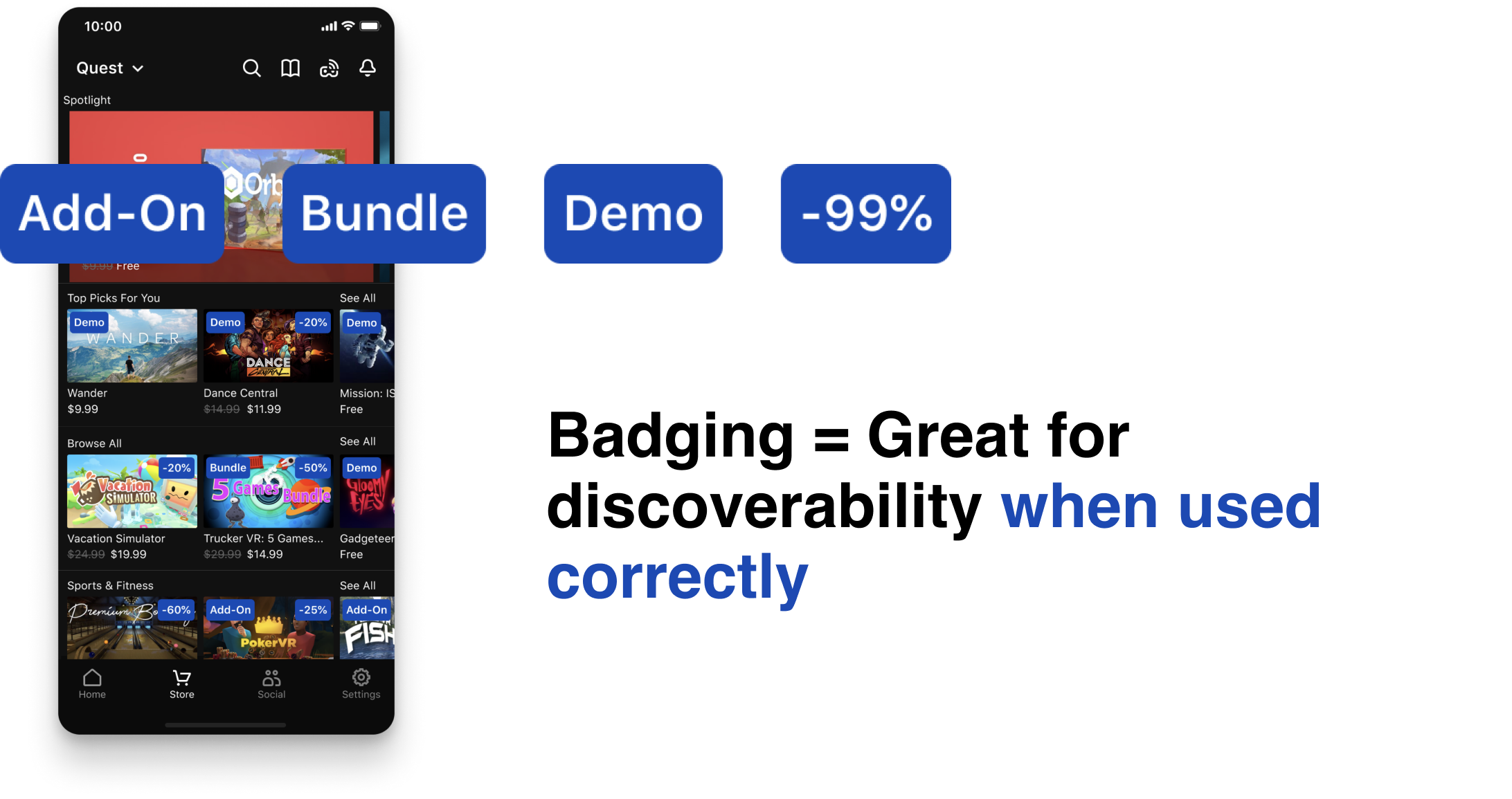
Surfacing content audit to evaluate the way the current system handles badging.
In order to better understand the current system, I conducted an audit of how users navigate to new releases and identified challenges they face.
PROBLEM EVALUATION
Main design challenge
How might we increase user exposure to newly released games in the Oculus app store?
Breaking down the problem
There are other new released apps that the user can view, but these are the only entry points without prior knowledge of release dates.
Break down of phone screens showing that new releases are not being accurately shown in the Oculus store
Top priority
How might we differentiate new apps among mixed content?
Stretch goal
How might we make the new releases shelf stand out more?
Stretch goal
How might we improve the new releases browsing experience?
BUSINESS VALUE
Previous research shows new releases drive a significant amount of revenue.
The first weeks account for a large x% of all purchases in the first few months. New releases drive x% of revenue, so its important users are able to easily discover them.
COMPETITOR ANALYSIS
I analyzed how various competitors help their users discover new products. Three main design trends emerged.
Competitor analysis of 3 kinds of discovery for new products: badging, categorizing and browsing.
BRAINSTORMING & IDEATION
Next I began ideating and exploring potential solutions.
I started with pen and paper, then worked my way up to high fidelity explorations with feedback from the XFN team.
iPhone with 4 different badges on top of it, showing that badging is only good for user discoverability when used correctly, otherwise it is distracting.
Two categories of badges: temporary and permanent.
The Oculus store is using badging to differentiate games in other ways, such as when a game is on discount. But it’s already pretty full.
Diagram of the 3 personas created for Unity.
Design idea
Temporary information is badged, permanent information below the cover
UX RESEARCH
1:1 user interviews with 10 Oculus Quest Owners over UserZoom (twice!).
I designed two user studies which were conducted by Tianyu Koenig. The second iterated on the findings of the first. Results of the studies are confidential.
Goal #1: Badging placement and iconography usage
Diagram of the 4 different variations for badges: next to the text or on top of image, then an icon or a text badge.
Goal #2: Modifying the new releases layout
Two different new release layouts that we tested on iPhone screens.
Goal #3: Taxonomy and discoverability of Bundle badge
Exploring how the new badging system would fit in with the bundle badges.
DESIGN OUTCOME
User discovery of new released apps
One big problem, three simple solutions.
A set of badges for new releases that fits with the current design system.
  • As new releases and play a major role in purchase decision, it’s crucial to keep this information as discoverable as possible.

  • This also keeps the system scalable, so that if there is other permanent information to come as VR evolves, it can also be placed below.
Video Thumbnail
Entry point for when to showcase a single major release close to release week.
  • There aren’t too many new releases, so intentionally advertising one makes sense.

  • Autoplaying the trailer makes the new release particularly stand out among the shelves, while allowing the user to scroll to see more details and featured images.
Video Thumbnail
A whole new way of browsing multiple new releases, while showcasing popular new apps.
  • I chose to modify the chart layout so that content could be seen in an intuitive way that the user is already familiar with.

  • This also eliminates the need for a second click into the new releases chart.
Video Thumbnail